Serbian Waterfalls
Transformed an unstructured interest site into a scalable discovery platform that dramatically increased engagement and sales
Context & Challenge
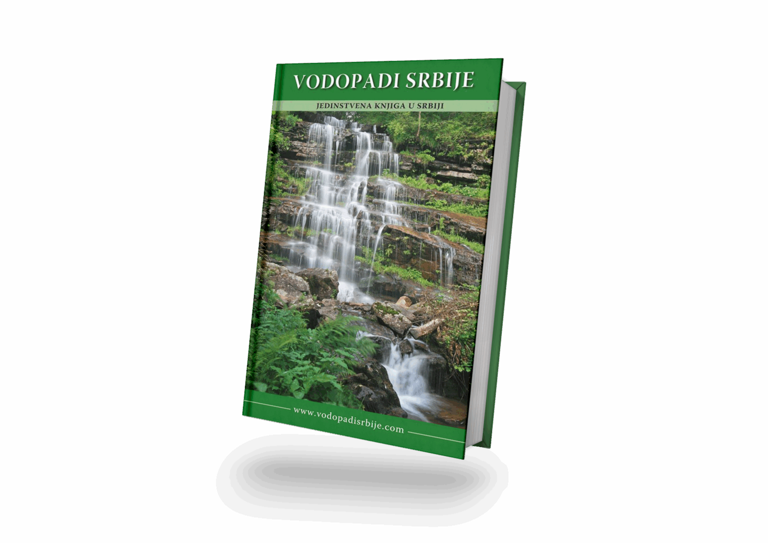
I collaborated with the author of Serbian Waterfalls to bring his long-term project to life – a book documenting over 100 waterfalls across Serbia.
While the photography and research were extraordinary, the presentation lacked cohesion. The goal was to design a clear, emotional visual identity and digital experience that balanced aesthetic storytelling with practical usability.
Research & Insights
From information to emotion. Most nature publications in Serbia were factual but visually static. I wanted Serbian Waterfalls to feel like a journey – immersive, poetic, and emotionally engaging.
Let photography lead. Readers exploring nature content are drawn to visuals first. Large-scale imagery and minimal text allow the waterfalls to speak for themselves.
One voice across print and digital. Both the book and website needed to share a calm, unified design language balancing readability with atmosphere.
Design Process
Research
Analysed existing nature and travel publications and identified visual gaps. Defined a visual direction rooted in minimalism, clarity, and emotional storytelling.
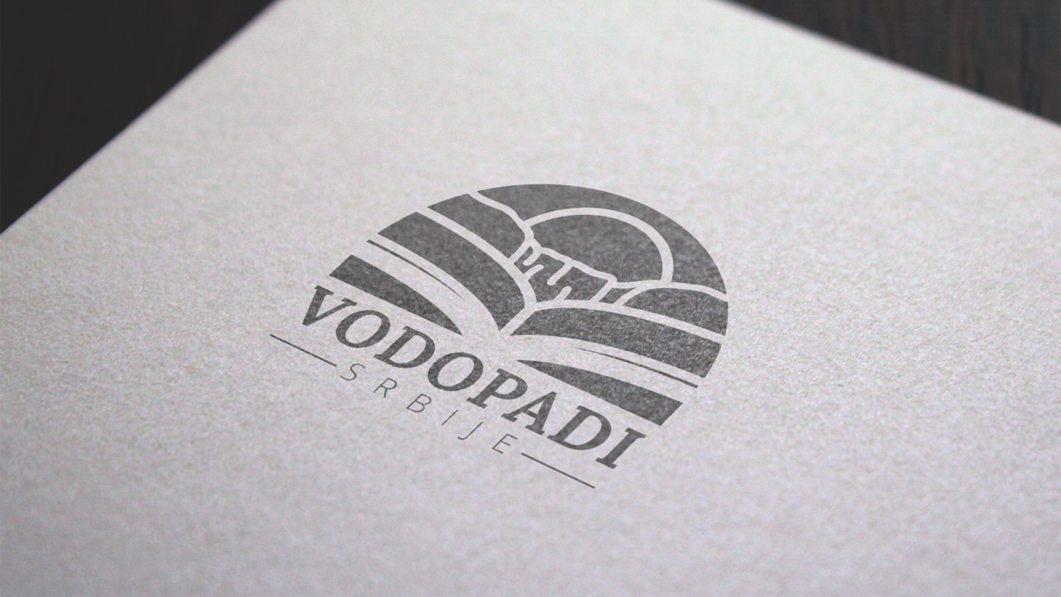
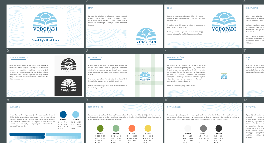
Branding
Created a visual identity inspired by nature: light blues and greens, balanced typography, and soft lines. The brand evokes calmness and trust while celebrating natural beauty.
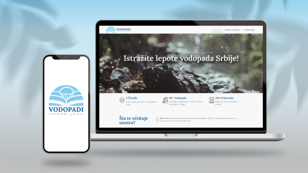
Web Design
Designed a clean, responsive website to showcase the book and highlight each waterfall category through immersive imagery. Minimal structure – full-width visuals, structured navigation, and intuitive CTA for purchasing.
Learnings & Reflection
This project reminded me how design can quietly enhance storytelling. Working on Serbian Waterfalls taught me that minimalism, when done with purpose, creates room for emotion – and sometimes the best design decision is to step back and let nature speak.