MozaIK Platform
Reduced cognitive overload and onboarding friction by clarifying workflows and decision paths in a complex trading environment
Context & Challenge
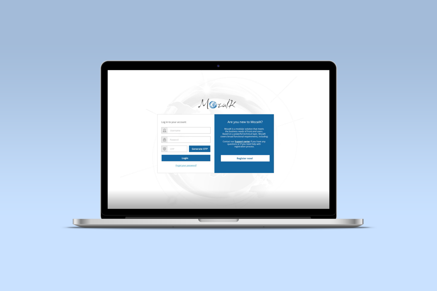
Mozaik is a fintech platform designed to support users navigating complex trading activities. As functionality expanded, the interface became increasingly difficult to orient – especially for new or less experienced users.
The core challenge wasn't visual quality. It was decision overload. Users struggled to understand where to start, recognize which actions mattered most, and maintain confidence while navigating high-risk financial decisions.

Research & Insights
Fragmented workflows. Switching between modules interrupted users' focus and slowed completion time.
Complex onboarding. Onboarding a new staff member required nearly a month of training.
Lack of visual cues. Users needed visual cues to recognize which module they were in and how tasks connected.
Design Process
Mapping Complexity
MozaIK contained dozens of features used by different departments. I started by mapping every interaction within the system, identifying overlapping processes and redundant screens. This revealed where users were losing context and helped define a clear, hierarchical structure for the new navigation model.
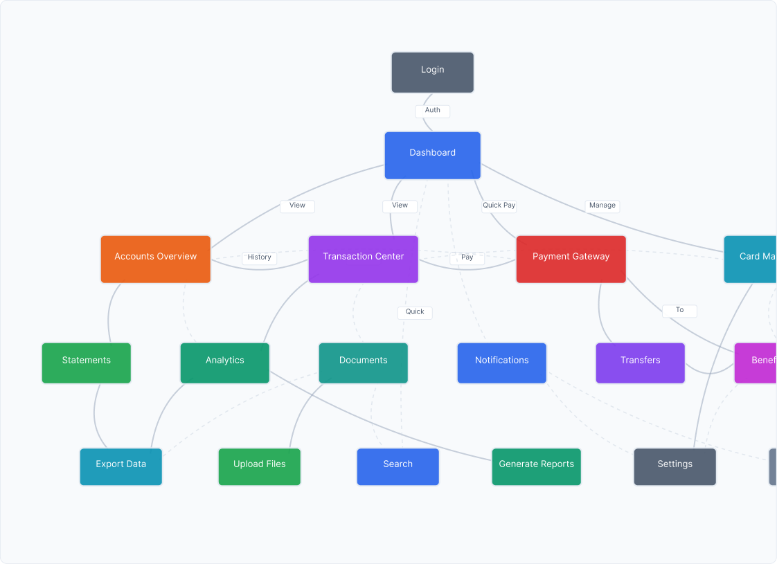
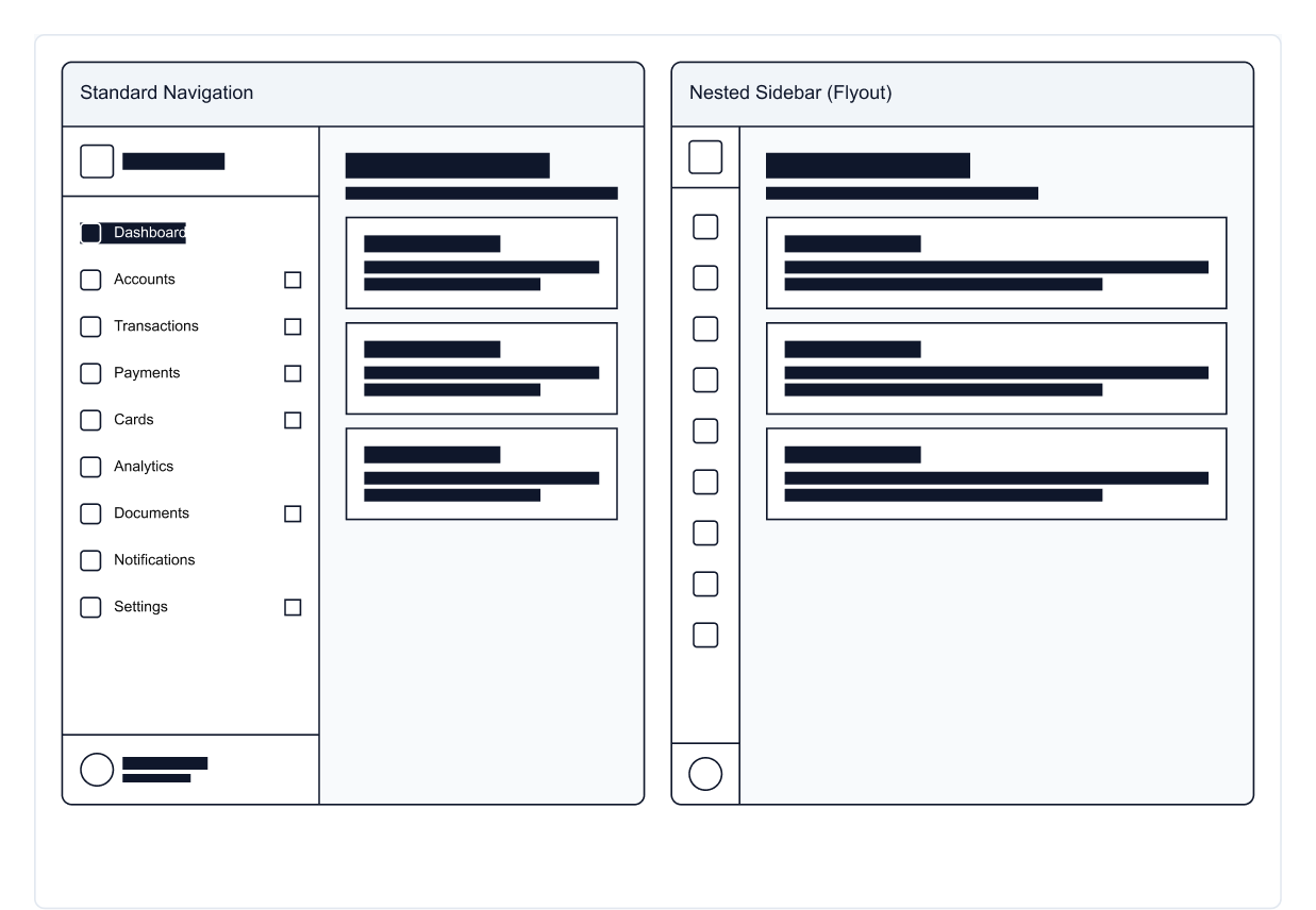
Unify navigation & reduce steps
Based on the maps, I proposed a single navigation model and a landing dashboard that surfaces the most-used actions and in-progress items. Labels, groupings, and paths were simplified so users could reach key tasks with fewer clicks.
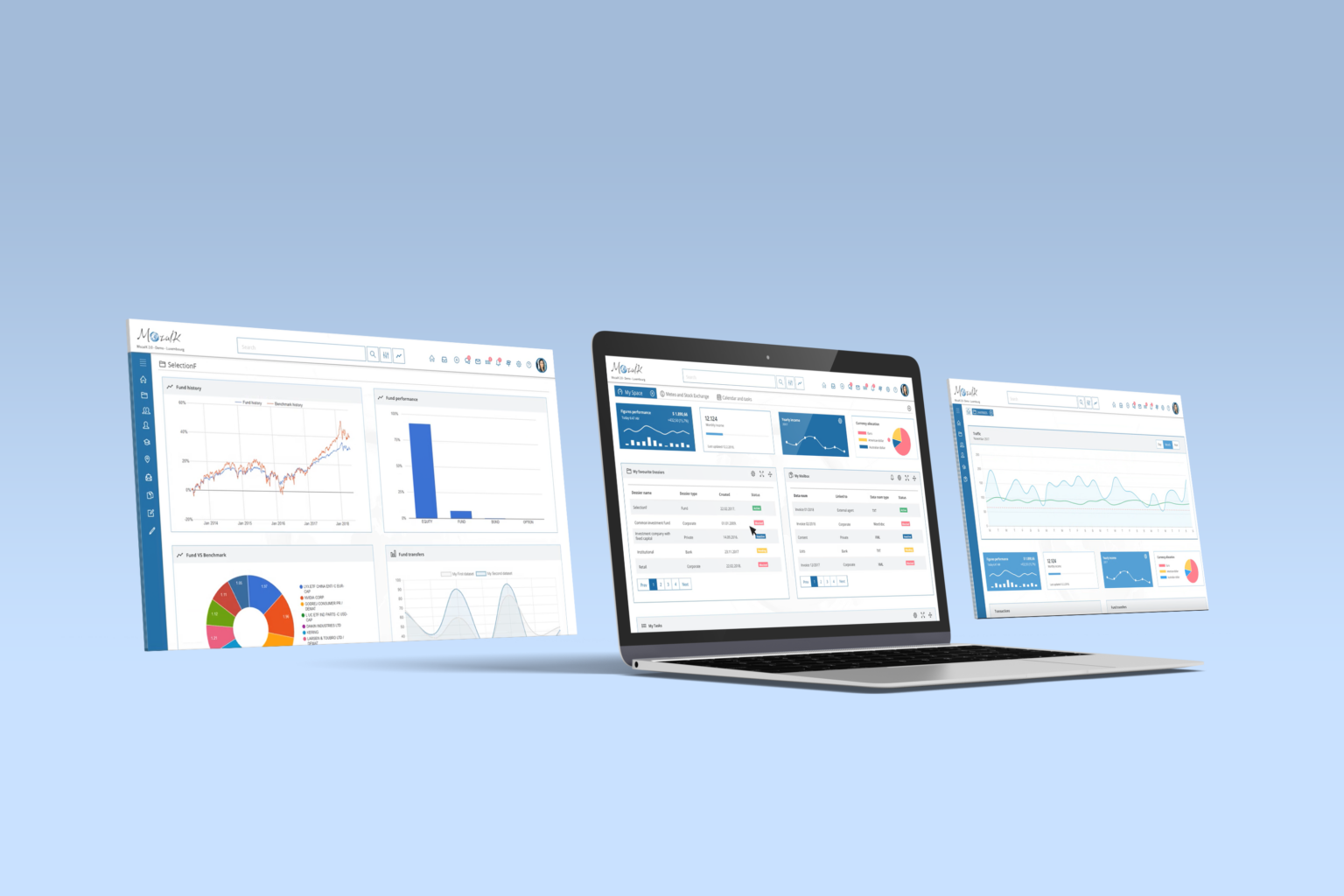
Systematize the UI
I created a reusable component library (cards, tables, filters, forms, notifications) with consistent typography, spacing, and color roles. This design system aligned teams, sped up delivery, and ensured new modules could plug in without visual drift.
Prototype, review, iterate
I created clickable prototypes to test the new flow and navigation with internal teams. Each round of feedback helped simplify dense screens, improve visual hierarchy, and make key actions easier to find.
Learnings & Reflection
Designing for financial software taught me that clarity equals trust. When complex systems are simplified, users make faster, more confident decisions.
If revisiting this project today, I'd focus on adaptive dashboards that tailor complexity to each user's role and data-driven insights that support decision-making in real time.