DOTS Platform
Enabled scientific teams to make faster, clearer decisions by simplifying complex data workflows and reducing cognitive load
Context & Challenge
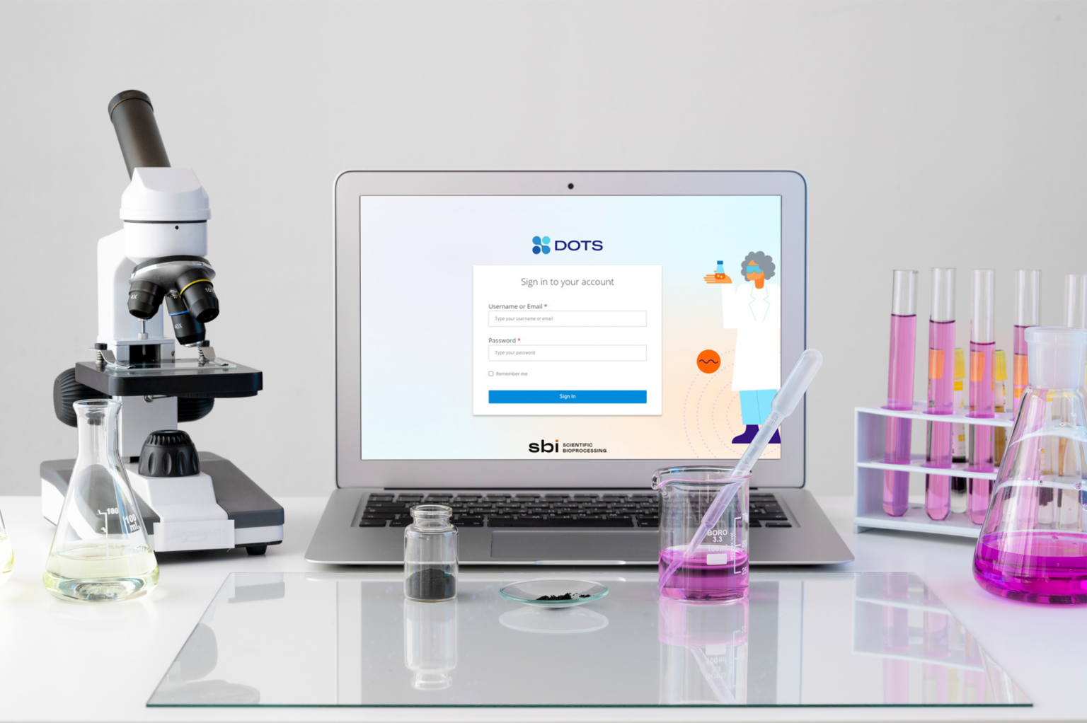
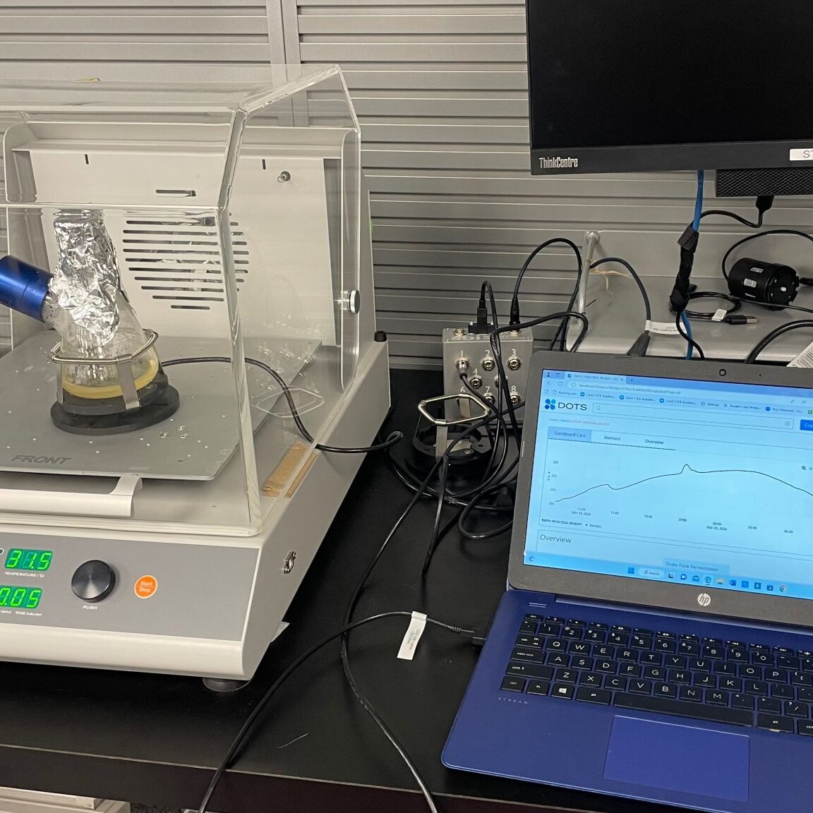
The DOTS Platform connects sensors and actuators to shake flasks - turning them into smart mini-bioreactors - but its interface increasingly slowed researchers rather than helped them work. Complex workflows, fragmented navigation, and inconsistent visuals were creating decision friction instead of insights.
How do we transform a powerful biotech tool into a trustworthy, clear interface that supports real scientific decision-making?
My Role & What I Was Asked to Solve
I was engaged to help the product team clarify core interaction decisions, define a scalable UX strategy, and develop a system that reduces cognitive overhead for scientists under pressure.
This required balancing technical complexity vs usability, scalability vs consistency, and visual information vs decision clarity.
Decisions & Strategic Approach
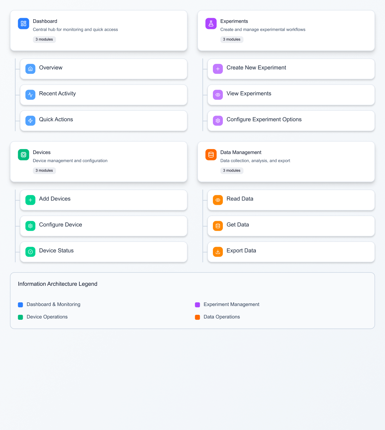
Key decisions. Prioritizing what information matters most for the user's decision moment. Structuring navigation to minimize context switching. Creating templates that supported frequent experimental setups.
Strategic insight. Users didn't need more features – they needed less friction and more clarity in key decisions, such as when and how to monitor experiment parameters.
Research highlights. Scientists were frequently interrupted by manual data checks. Visual clutter masked critical experiment metrics. Users repeatedly rebuilt the same configuration patterns.
How Outcomes Were Delivered
Rather than adding more screens or features, I helped the team unify dashboards to surface multiple key parameters simultaneously, simplify navigation so scientists spend less time switching contexts, introduce quick-start templates that cut setup time significantly, and build a modular card system allowing future expansion without redesign.
The design system wasn't a cosmetic layer – it became the shared language between product, design, and engineering that supported real product decisions.
Key Takeaways
Designing for scientists taught me that usability is a form of trust. When every data point matters, the interface must disappear – leaving only clarity.
If revisiting this project, I'd invest in guided onboarding and smart alerts that detect anomalies early, further aligning human intuition with machine precision.
The modular design system didn't just improve consistency – it created a shared language between design and engineering teams, accelerating the entire product development cycle.