Transformed an unstructured interest site into a scalable discovery platform that improved user clarity and dramatically increased engagement and sales.
IMPACT
+810% increase in book sales in 4 months
+150% growth in session duration
Improved content discoverability and user paths
Context & Challenge
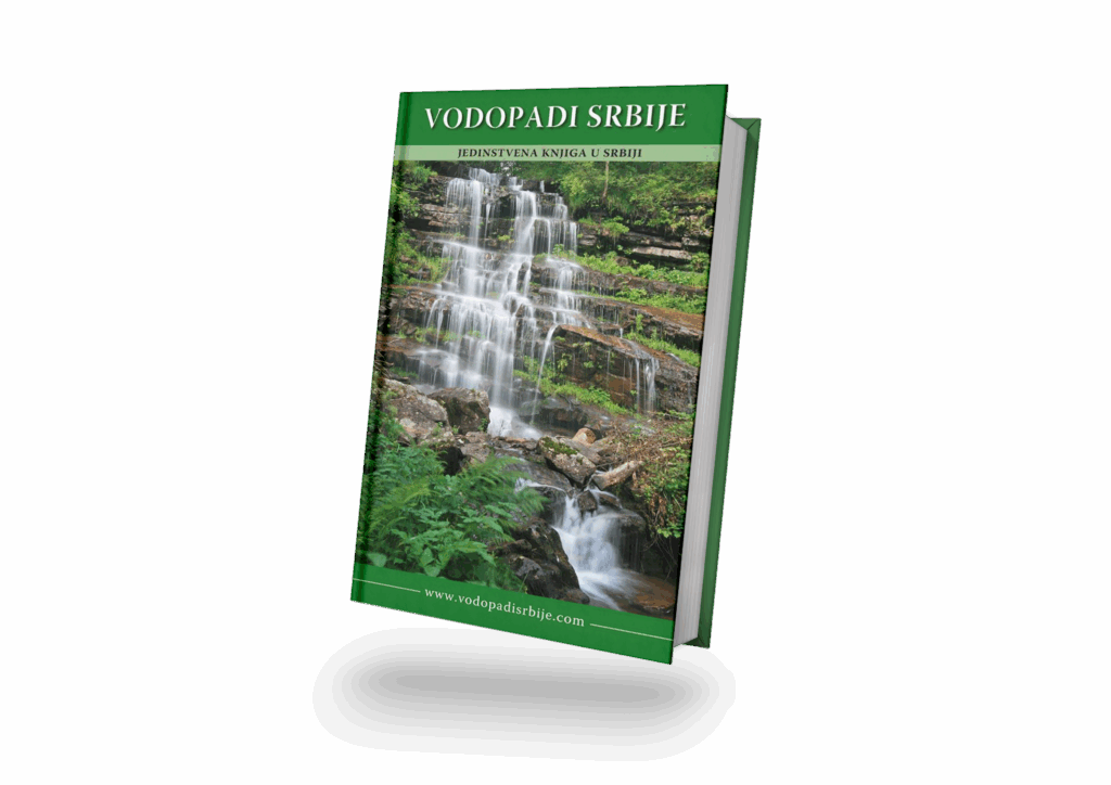
I collaborated with the author of Serbian Waterfalls to bring his long-term project to life – a book documenting over 100 waterfalls across Serbia.
While the photography and research were extraordinary, the presentation lacked cohesion. The goal was to design a clear, emotional visual identity and digital experience that balanced aesthetic storytelling with practical usability – guiding readers through the landscapes while preserving the serenity of nature itself.
Research & Insights
From information to emotion
Most nature publications in Serbia were factual but visually static.
I wanted Serbian Waterfalls to feel like a journey – immersive, poetic, and emotionally engaging, not just informative.
Let photography lead
Readers exploring nature content are drawn to visuals first.
Large-scale imagery and minimal text allow the waterfalls to speak for themselves while guiding the viewer’s attention through composition and rhythm.
One voice across print and digital
Both the book and website needed to share a calm, unified design language.
I created a visual system that balances readability with atmosphere – simple typography, soft colours, and layouts that feel as organic as the landscapes themselves.
Design Process
STEP 01
Research
I analysed existing nature and travel publications and identified visual gaps – most lacked hierarchy, atmosphere, and digital coherence.
This phase helped define a visual direction rooted in minimalism, clarity, and emotional storytelling.
STEP 02
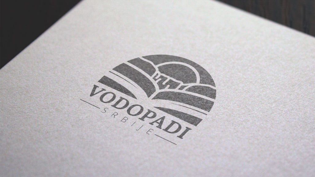
Branding
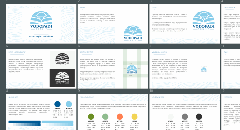
Created a visual identity inspired by nature: light blues and greens, balanced typography, and soft lines.
The brand evokes calmness and trust while celebrating natural beauty without distractions.
STEP 03
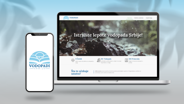
Web Design
Designed a clean, responsive website to showcase the book and highlight each waterfall category through immersive imagery.
The site structure was kept minimal – full-width visuals, structured navigation, and an intuitive CTA for purchasing the book.
Final Solution
Print: Spacious layouts and minimalist typography allowed photography to dominate while keeping reading flow natural.
Digital: The website serves as both a gallery and sales point, with full-screen visuals, interactive navigation, and location tagging for featured waterfalls.
Unified system: Both platforms share colour palette, type, and tone – creating a seamless bridge between print and digital.
Outcome & Impact
+800% book sales in the first 4 months
The redesign significantly improved visibility, turning a passion project into a commercial success story.
Consistent brand presence across platforms
For the first time, the author’s work existed under one cohesive visual identity, from print to digital.
Increased tourism interest in local destinations
The project sparked curiosity among local travellers and nature enthusiasts, helping highlight Serbia’s lesser-known natural landmarks.
Learnings & Reflection
This project reminded me how design can quietly enhance storytelling.
Working on Serbian Waterfalls taught me that minimalism, when done with purpose, creates room for emotin – and sometimes the best design decision is to step back and let nature speak.
We use cookies to ensure that we give you the best experience on our website. If you continue to use this site we will assume that you are happy with it.