Reduced cognitive overload and onboarding friction by clarifying workflows and decision paths in a complex trading environment.
IMPACT
Clearer onboarding for new users
Reduced task confusion in high-stakes financial flows
Improved usability across core trading interactions
Context & Challenge
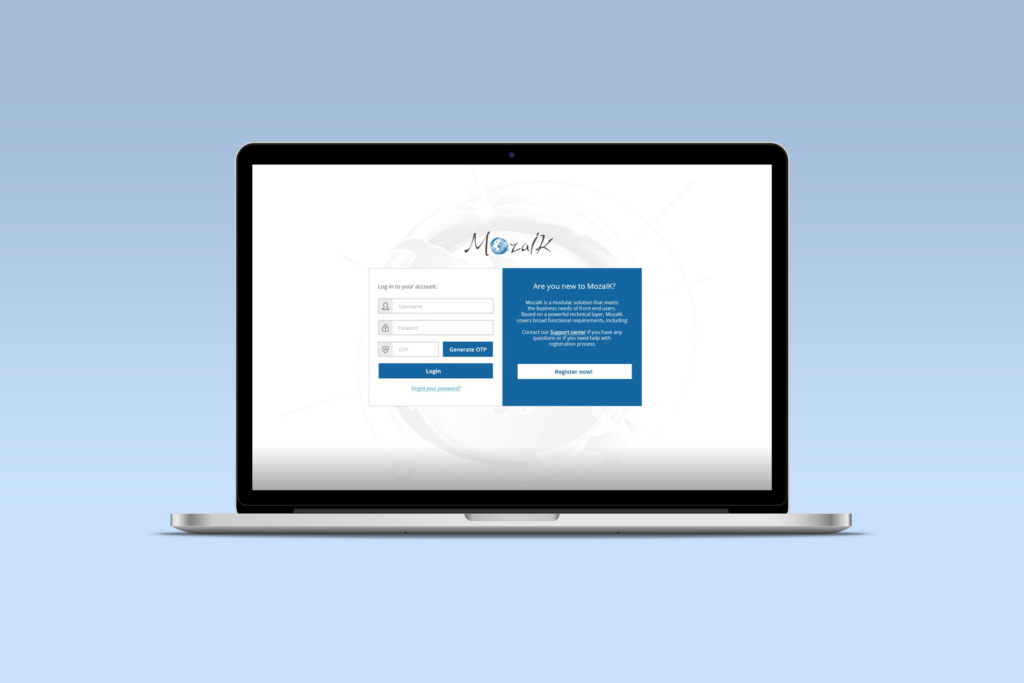
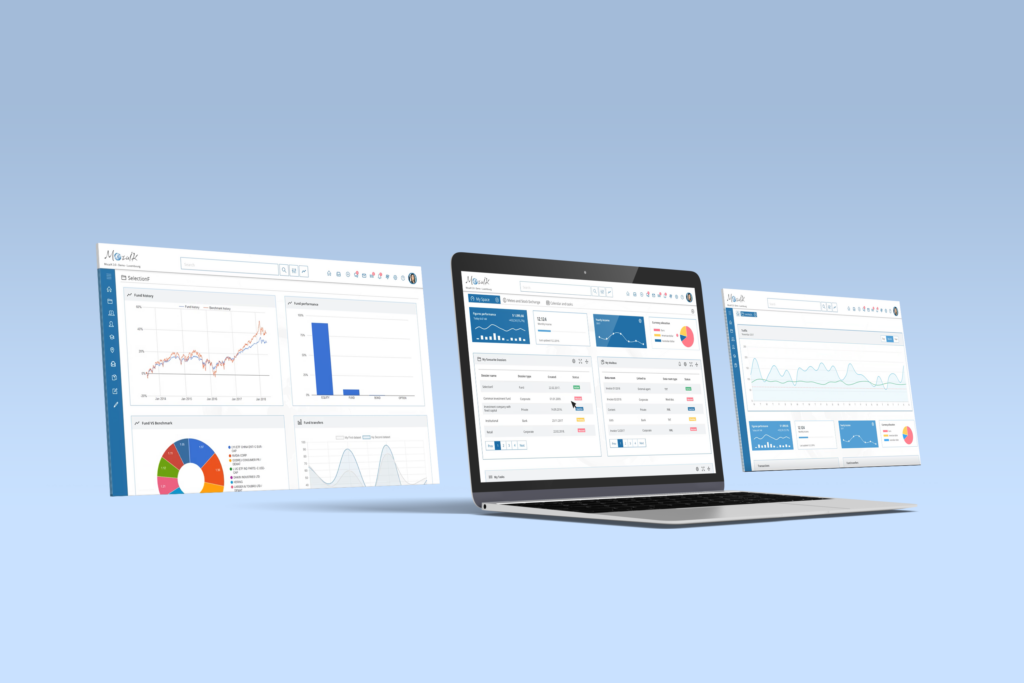
Mozaik is a fintech platform designed to support users navigating complex trading activities. As functionality expanded, the interface became increasingly difficult to orient – especially for new or less experienced users.
The core challenge wasn’t visual quality.
It was decision overload.
Users struggled to:
Understand where to start
Recognize which actions mattered most
Maintain confidence while navigating high-risk financial decisions
Research & Insights
Fragmented Workflows
Switching between modules interrupted users’ focus and slowed completion time.
Complex Onboarding
Onboarding a new staff member required nearly a month of training.
Lack of Visual Cues
Users needed visual cues to recognize which module they were in and how tasks connected.
Design Process
STEP 01
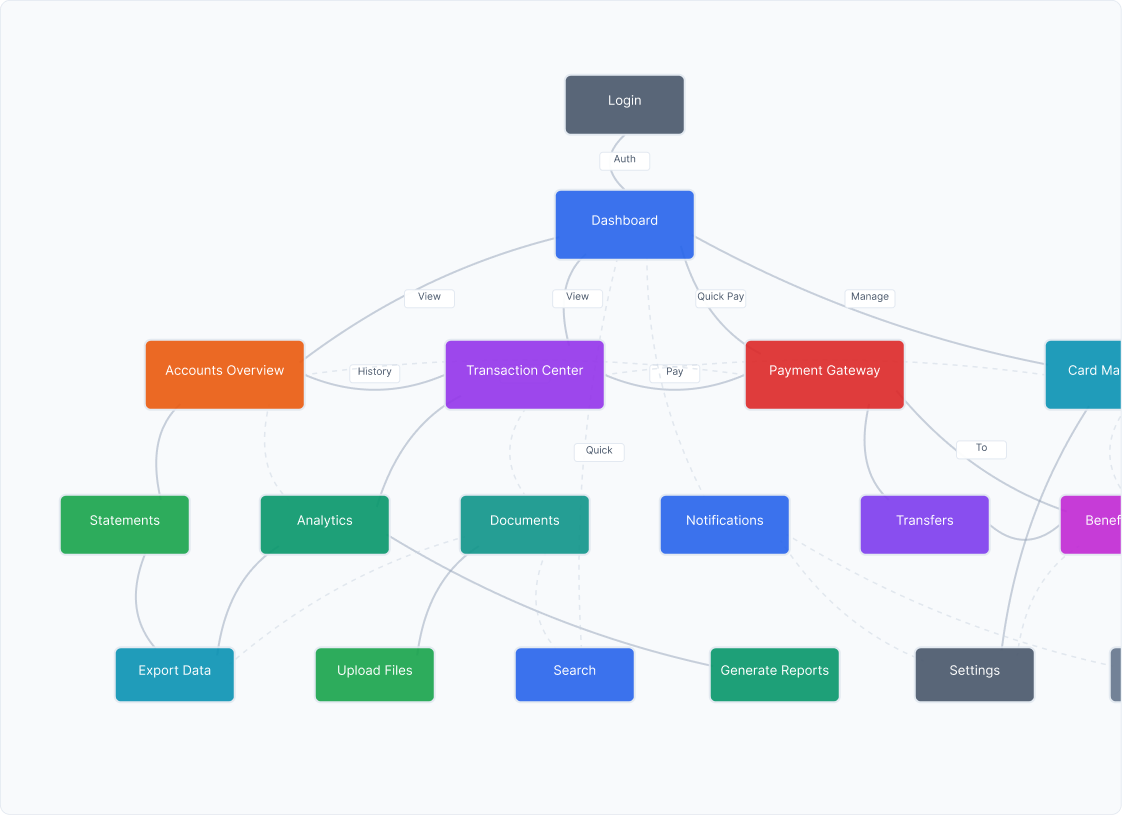
Mapping Complexity
MozaIK contained dozens of features used by different departments – from compliance teams to client managers.
I started by mapping every interaction within the system, identifying overlapping processes and redundant screens.
This revealed where users were losing context and helped define a clear, hierarchical structure for the new navigation model.
STEP 02
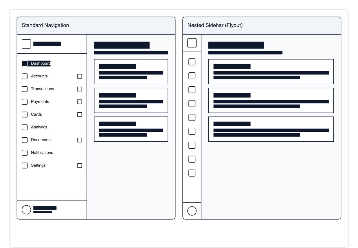
Unify navigation & reduce steps
Based on the maps, I proposed a single navigation model and a landing dashboard that surfaces the most-used actions and in-progress items. Labels, groupings, and paths were simplified so users could reach key tasks with fewer clicks.
STEP 03
Systematize the UI
I created a reusable component library (cards, tables, filters, forms, notifications) with consistent typography, spacing, and color roles. This design system aligned teams, sped up delivery, and ensured new modules could plug in without visual drift.
STEP 04
Prototype, review, iterate
I created clickable prototypes to test the new flow and navigation with Jiway’s internal teams.
Each round of feedback helped simplify dense screens, improve visual hierarchy, and make key actions easier to find.
The process was fast, collaborative, and focused on making the platform feel lighter and more intuitive for everyday users.
Outcome & Impact
–35% Faster Onboarding
A clearer structure and simplified workflows helped new employees get productive sooner – reducing training time from four weeks to under three.
–40% fewer user errors
Consistent UI patterns and improved hierarchy cut repeated mistakes and reduced support tickets in the first six months after launch.
–33% quicker module rollout
The new design system allowed developers to add features faster, shortening release cycles and supporting quicker delivery across partner banks.
1,000+ professionals using MozaIK
Unified navigation and modernized dashboards improved satisfaction and drove platform adoption across multiple European financial institutions.
Learnings & Reflection
Designing for financial software taught me that clarity equals trust. When complex systems are simplified, users make faster, more confident decisions.
If revisiting this project today, I’d focus on adaptive dashboards that tailor complexity to each user’s role and data-driven insights that support decision-making in real time.
We use cookies to ensure that we give you the best experience on our website. If you continue to use this site we will assume that you are happy with it.