DOTS Platform
CATEGORY
Product Strategy · UX Strategy · Technical Complexity
OUTCOME
Enabled scientific teams to make faster, clearer decisions by simplifying complex data workflows and reducing cognitive load.
IMPACT
- -33% setup time for experiments
- Real-time data clarity enabling confident decisions
- -30% design-development handoff time through scalable system
- +18% user satisfaction in usability feedback
Context & Challenge
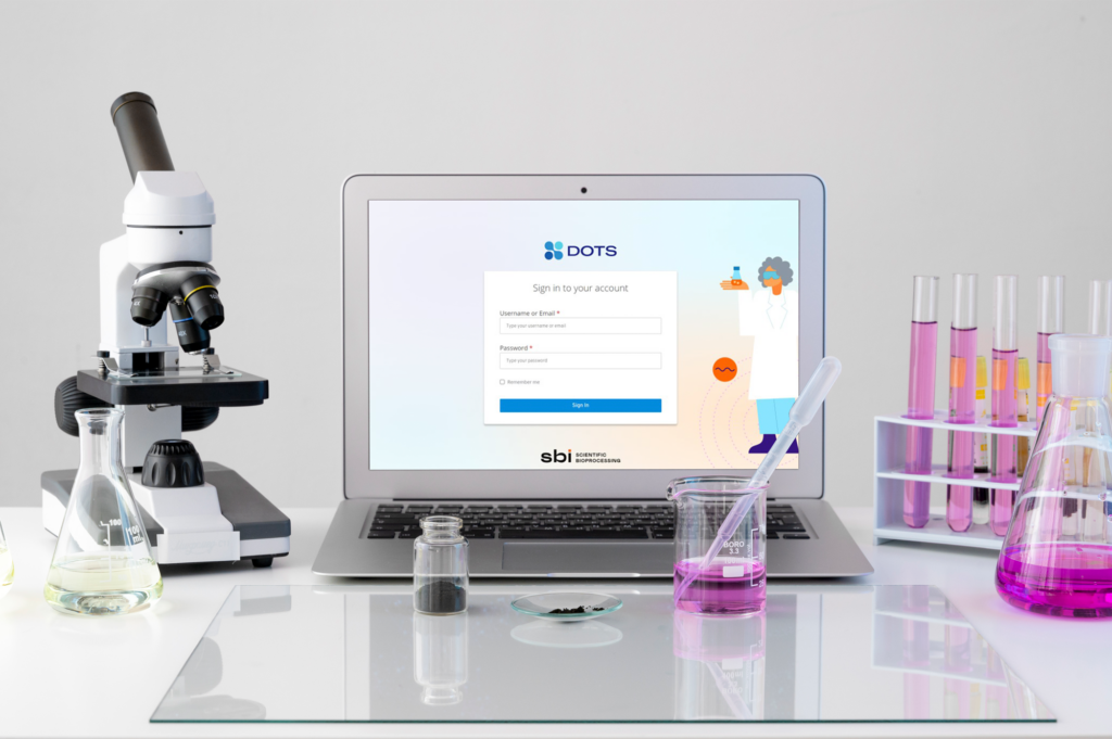
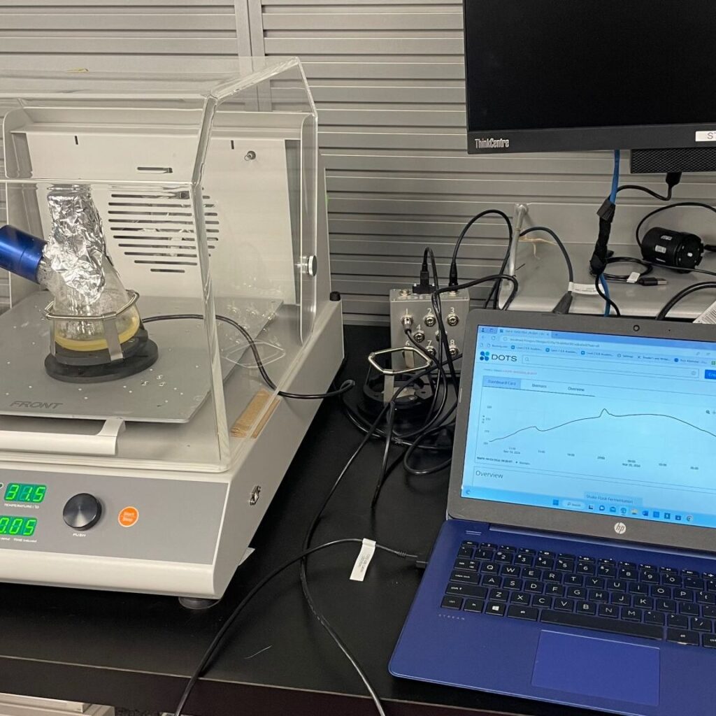
The DOTS Platform connects sensors and actuators to shake flasks – turning them into smart mini-bioreactors – but its interface increasingly slowed researchers rather than helped them work. Complex workflows, fragmented navigation, and inconsistent visuals were creating decision friction instead of insights.
My Role & What I Was Asked to Solve
I was engaged to help the product team clarify core interaction decisions, define a scalable UX strategy, and develop a system that reduces cognitive overhead for scientists under pressure.
This required balancing:
- Technical complexity vs usability
- Scalability vs consistency
- Visual information vs decision clarity
Decisions & Strategic Approach
KEY DECISIONS INCLUDED
- Prioritizing what information matters most for the user’s decision moment
- Structuring navigation to minimize context switching
- Creating templates that supported frequent experimental setups
STRATEGIC INSIGHT
Users didn’t need more features – they needed less friction and more clarity in key decisions, such as when and how to monitor experiment parameters.
Research highlights shaping decisions
- Scientists were frequently interrupted by manual data checks, pulling focus from core experiment tasks.
- Visual clutter masked critical experiment metrics.
- Users repeatedly rebuilt the same configuration patterns.
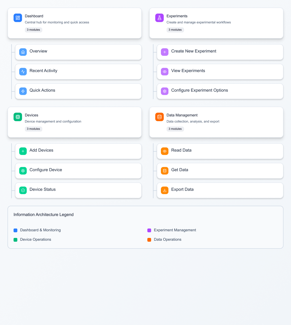
How Outcomes Were Delivered
- Unify dashboards to surface multiple key parameters simultaneously
- Simplify navigation so scientists spend less time switching contexts
- Introduce quick-start templates that cut setup time significantly
- Build a modular card system allowing future expansion without redesign
The design system wasn’t a cosmetic layer – it became the shared language between product, design, and engineering that supported real product decisions.
Strategic Impact
The result was not just a prettier interface – it was a system that helped users make better choices faster.
Measured outcomes:
- Setup time reduced by 33% – experiments begin more quickly with less manual overhead
- Clarity increased decision confidence – researchers could focus on outcomes, not tools
- Handoff time cut by 30% – more predictable design-development cycles
- +18% user satisfaction – direct feedback from lab technicians who now enjoy using the platform
Using the DOTS Platform, we were able to gain actionable insights from our CHO shake flask cultivations. This allows us to reduce sampling as important data are given online and in real time.
Vivian Ott (Centre for Cell Cultivation Techniques, ZHAW, Switzerland)
Key Takeaways
Designing for scientists taught me that usability is a form of trust. When every data point matters, the interface must disappear leaving only clarity.
If revisiting this project, I’d invest in guided onboarding and smart alerts that detect anomalies early, further aligning human intuition with machine precision.
The modular design system didn’t just improve consistency it created a shared language between design and engineering teams, accelerating the entire product development cycle.